
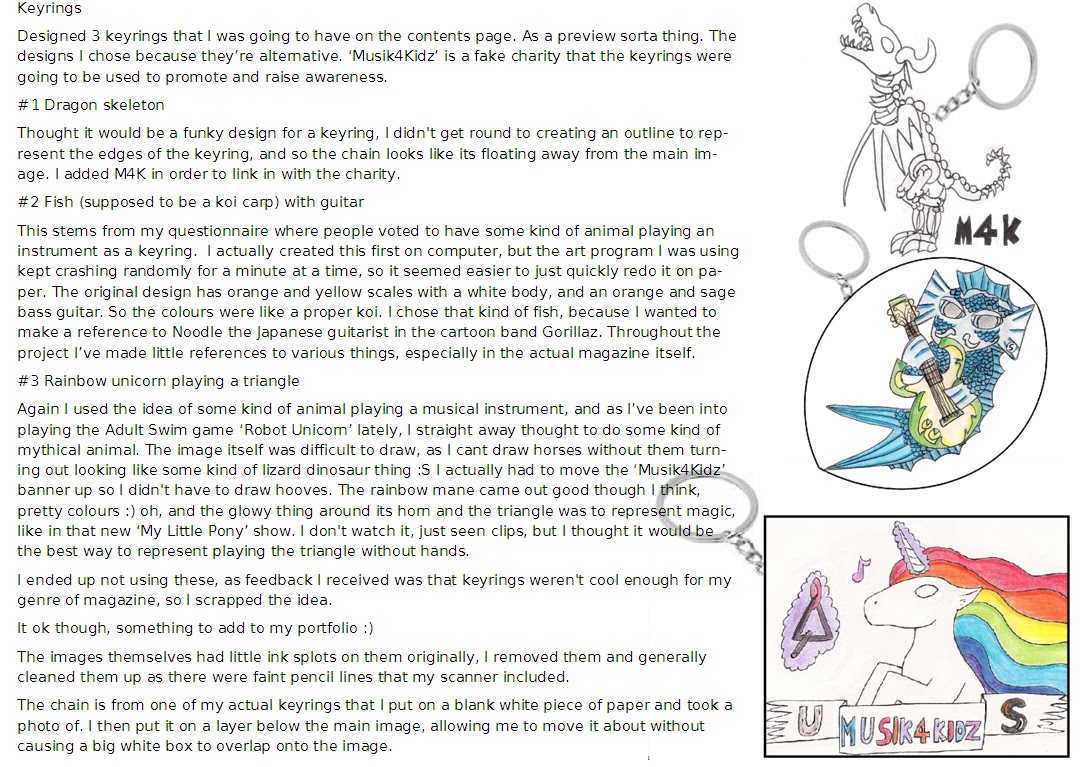
Monday, 30 April 2012
Friday, 27 April 2012
Final Versions

Front
Cover
Since
the versions I posted just before the Easter holidays, I've changed the front
page about a fair bit.
I
removed the keyring box due to feedback saying it's tacky and doesn't conform
to music magazine conventions, not to mention that my style models don't gift
keyrings.
- I re-wrote the upper left corner information to match the new contents page, and also removed the white outline to make it neater.
- I flipped the main image as it looked odd having a big blank space, and the text didn't look right where the keyring box was.
- The text I added last minute to make it look more authentic.
- I changed the colour of the bottom text so it's more eye-catching, and so it’s more colour variety. Not just glaring orange and white. It also emphasizes the blueish background and the model's purple earrings and top.
- Fixed a little spacing issue on the barcode.
I
have conformed to the convention of my main style models Q and NME by having a
big main image with superimposed text on top. I have also conformed to the
concept of a simple, clear colour scheme that works together. Added the little
S as I've seen it like that in Q magazine and I liked it, as it's a strong
reminder of what magazine this is and what exactly you’re going to be paying
for.
To
edit the main image, I used Adobe Photoshop. I used the spot healing brush and
patch tool, and cropped the image down to a close up/mid shot. The fonts I used
were Bitstream Vira Sans, Broadway, Hobo Std, and the basic Arial font. I used
Adobe InDesign to create all the pages, a new program for me which I had to
learn to use fairly quickly! Photoshop is also new to me, though my experience
working with Macromedia Fireworks Artweaver Free and Adobe Illustrator helped
me grasp the basics quickly.
In
InDesign, I used the Text Box tool, Shape Tool, Direct and normal Selection
Tools, the Eyedropper Tool, Rotate Tool, Colour Picker Window, and a fair bit
of the zoom in and out tool. The newest tool I’ve learnt to use is the Frame
Tool, which I never even used when creating my magazine. I did when doing a
rough plan of where things are going to go, but in the end it was just easier
to place images and text directly onto the page, rather than mess about with
frames.
If
I could change anything now, I'd add a few more little features on the front
cover. Like a circle with text in, and I’d redo the logo as I think this one
looks tacky.
What
I like about my front cover is the main image itself (eye-catching and quirky,
fits with the genre!) and the quote below the name.
I believe it appeals to my target audience of young teens to young adults, as it looks trendy and hip. Something the audience would be willing to be seen buying.


I believe it appeals to my target audience of young teens to young adults, as it looks trendy and hip. Something the audience would be willing to be seen buying.

Contents
Page
Definitely
changed it a bit!
- Removed the keyring section as I no longer was using it.
- Removed the legal information and moved address information to below the back issue info to clear space and reduce text.
- Added the photo in place of the keyrings to add variety, put a quote on and the band name, along with a page number.
- Removed the second image, and put one big image instead. This reduces cluttering and makes the design adhere to Q magazine contents page, as they usually have a big main image, with other smaller images dotted around.
- I put the editors note in a blank space, looked odd otherwise.
- Changed the front cover image In the top right corner to match the new cover.
I’ve
added little details such as a page number and logo, issue date and printing
information, in order to make it seem more believable as an official music
magazine. The little S is again based on Q magazine, which has the logo on the
bottom of pages, and in the address information.
Continued
the house style by having the orange colour and the fonts Broadway and
Bitstream Vira Sans. This helps to tie the front page to the contents page,
making it flow.
The
images I edited in Photoshop. Magnetic lasso and Quick Selection tools were
used on the big main image to cut it out, and a black and white Colour
Adjustment on the second image, which gives it an atmosphere and edge, which
you would expect in an indie magazine.
If
I could change anything, I would move the printing information down a little,
as theres space at the bottom, making it look odd to be so close to the orange.
I’d also move the website address over to the left, but I think it’s ok as it
is right now.
Things
I like about my contens page, is the back issue information, address and
printing information. I also like how the editors note works with the orange
‘glow’, drawing the viewer’s vision to the edges of the orange, to find the
note there.

Double
Page Spread
Before
Easter, I had no image, the text was too big, and there was no additional
information about the artist.
- Added release information for the album
- Removed one of the quotes, as I added breakout quotes to make it less of a block of text.
- Added a caption to the image, wrote more as way of a subtitle to identify what kind of artist she is.
- I wrote more text, as I had to reduce the font size to 10 which drastically reduced the amount of text I had.
- Fixed little typos and grammar mistakes here and there.
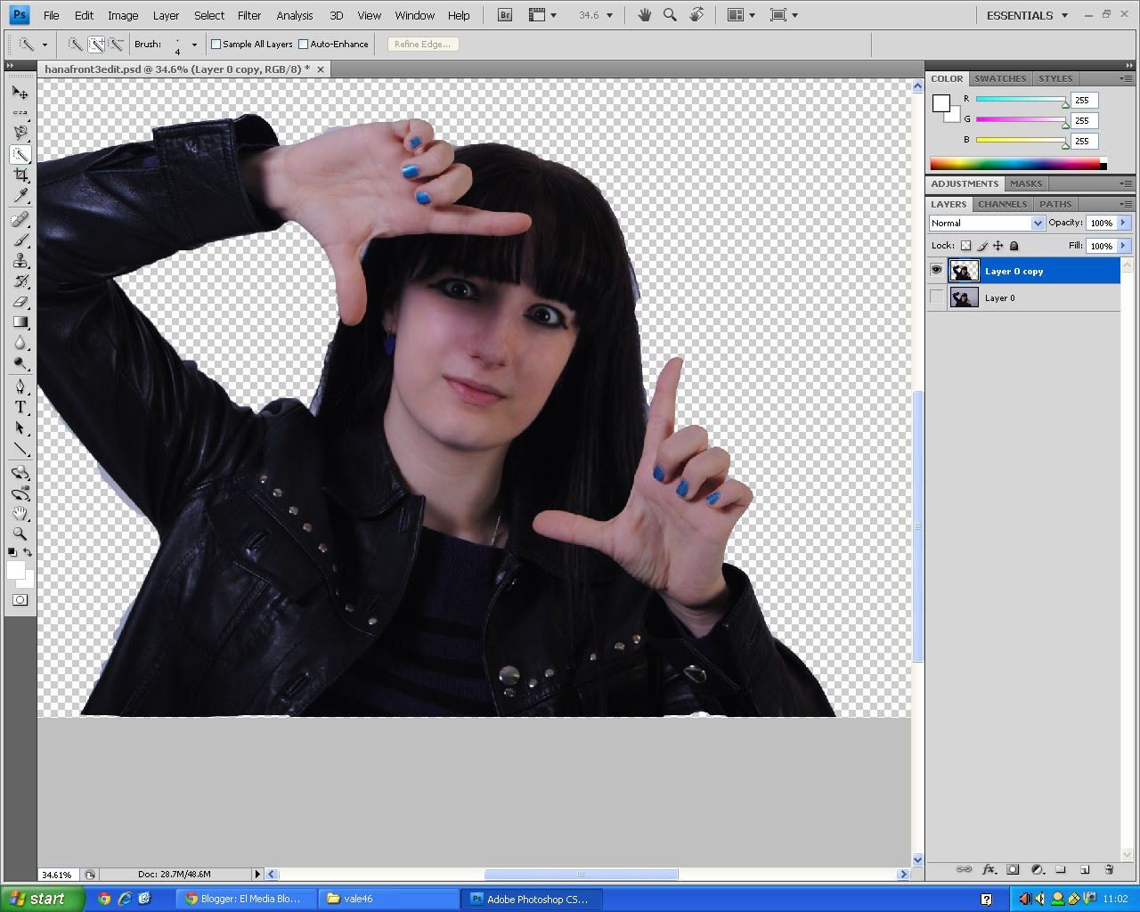
The
main image I edited in Photoshop. I duplicated the main image layer, and cut
out the model in one. I then added a red Colour Adjustment to it, and did a blue/green
colour adjust to the layer behind it. This gives it a slightly 3D, interesting
appearance, which works with the alternative/indie vibe I’m trying to create in
the magazine.
I
like the colours, the page number/logo/issue date thing, and I had fun writing
the Q&A for the spread.
I
don’t like how sparse the main image is, if I could, I’d fiddle about with the
album information abit, maybe make it into a proper information box.
Diary Entry Five
Bonjourno!
I met the deadline! :D Am just about to post my final pages with my thoughts.
I've blogged my keyring designs, my album cover designs, and what photos I've used before and after editing.
I've started ti write a script for my evaluation, i'm going to do a video with some music and me talking and answering the questions. I should have that completed and posted before or on the deadline of 28th of May (though I want to do planning on my blog, so perhaps before or on May 1st?).
Album Covers

I did them just before the rough cut deadline, and the hand drawn ones I did the day before the final deadline.

Sunday, 22 April 2012

Wednesday, 18 April 2012
Diary Entry Four
Allo!
Since my last diary entry, I have posted my rough cuts with Teacher feedback. I didn't include peer feedback, as there's so many contradictions and little niggling things which just arn't worth changing. Nevertheless, I will go through it again and post any relevant feedback that hasn't been mentioned in my teacher feedback.
Moving on! I posted the pages in the state they we're before we broke up for Easter holidays.
In the one proper day I've been back and working on the magazine, I have changed a few things around that I wasn't happy with, aswell as changing the size of the text to regulation 10.
Ongoing things are:
. Organise photos for contents page and double page spread
. Finish keyring designs (will post them on the blog with comments)
. Do album cover montage for contents page image
Friday, 30 March 2012
State Before Easter Holidays

Front cover:
- Added a strapline to identify what genre of music it's aimed at.
- Only have the main feature on the image, I have changed the upper left triangle to what the new contents are.
- I edited the image to remove blemishes, make it look more professional.

Cover Page
- Reduced amount of text
- Got rid of some lines
- Cut down to just two images (main feature and montage)

Double Page Spread
- Adjusted colours, tried to make it look unique with inclusion of a different text, but continued house style
- Added another column of text
Thursday, 29 March 2012
Rough Cut Feedback
 Front Cover
Positive:
- Quirky, Striking image
- Strong colour scheme
- Need to clarify genre, what is it?
- More focus on music
- Could improve fonts
- Dig main feature
 Contents Page
Positive:
- Inclusion of front cover
- Features montage
- Chunky page numbers
- Recycle details etc
To be improved:
- Too table like
- Use less text
 Double Page Spread
Positive:
- Details, some layout elements
To be improved:
- Needs style variation
- Photo quality
- Needs 3 columns, more text needed
Wednesday, 28 March 2012
Photoshop For Dummies
 |
| Looooooooading |
 |
| Loaded and ready for action Boom! there it is! |
 |
| Barely used half of these |
The Marquee Tool acts like a shape tool really, allows you to select content of a layer much like the selection tool in MS Paint.
The Lasso Tool is the same as the Marquee Tool, only it allows you to draw selections freehandedly. This is useful for if you want to select something complex and not of a basic shape.
The Wand Tool lets you select within the confines of edges, the amount it selects can be defined by the tolerance meter which appears on the bar at the top once you've selected the tool.
The Crop Tool allows you to cut the canvas (whole image) down to the desired size.
The Eyedropper Tool lets you take a sample of a particular colour to replace the current colour in your swatch. This makes it easy to switch between colours, and speeds up the process of whatever your doing.
Healing Brushes and the Patch Tool are ones I used in my project, and they're used for covering up and fixing.
The Brush Tool is your paintbrush, when selected, options for brush head type and size appear on the bar at the top.
The Stamp Tool allows you to take a sample of a layer, then 'paint' it at another location on the canvas.
The History Brush Tool acts as a kind of eraser tool, only it rubs out the image and replaces it with what colour is underneath.
The Eraser Tool does what it says on the tin. It rubs out stuff.
The Gradient Tool allows you to create a gradient in the colour of your current swatch. The Paint Bucket Tool completely fills in a layer with your colour swatch.
The Blur/Smudge Tool makes what your using the tool on go all smudgy.
Dodge/Burn tool makes the colours go funny.
The Pen tool allows you to create a freehand straight line, which allows you to curve at the edges.
The Text Tool allows you to create text.
Selection Tool allows selection.
Shape Tool allows you to create shapes.
3D Tool means you can create 3D stuff.
3D Camera Tool means you can look around the 3D stuff.
The Hand Tool lets you move around the layer.
The Zoom Tool lets you zoom in or out of the image.
 |
| Or you could do the keyboard shortcut Ctrl+O |
You can create a new document by selecting new, but in this tutorial, i'm going to be using a document that already exists.
 |
| Lots of files! All the photos I took |
 |
| For this tutorial I used the image that appears on my front cover. On the magazine, I flipped it horizontally. |
 |
| Not everyone does this, but I find it's handy to have a spare original layer hanging around. |
 |
| Next up is to duplicate it. |

 |
| I then make the bottom layer non visible by clicking the little eye picture. This helps prevent confusion in the long run. |
 |
| Yeehaw! |
 |
| Just quickly using it in this tutorial, nothing too neat. |
 |
| AH CHOOO! |
 |
| Fixed! |
 |
| Ready for deleting. |

 |
| Rough around the edges, but it was a quicky. |
 |
| The quick selection tool can also be used for the cutting of the outside, i just find the magnetic lasso does a better job. |
 To get rid of that triangle of background, I use the Quick Selection Tool.
I click and drag inside the triangle, and it automatically selects it.
 A quick press of delete and it's all good! I then deselected the selection by using Ctrl+D.
You can now go round the edges with the eraser Tool to neaten it, using a layer of colour behind (inbetween layer0 and layer0 copy) the top layer can help see the edges more clearly.
Tuesday, 27 March 2012
Diary Entry Three
I've finished the initial sketches (still need to colour double though), done my audience research (need to record someone answering questions), and my rough cuts are done in time for the deadline that was on the 20th of march.
In upcoming weeks, im going to post my rough cuts with evaluation and feedback received, my photos and images im going to be using (originals and edited versions), and finish colouring the double page draft and record the audience research answers.
I'll update the diary when I've completed things.
In upcoming weeks, im going to post my rough cuts with evaluation and feedback received, my photos and images im going to be using (originals and edited versions), and finish colouring the double page draft and record the audience research answers.
I'll update the diary when I've completed things.
Thursday, 22 March 2012

Monday, 19 March 2012
Audience research
 1, How often do you read music magazines?
I asked this question in order to get an idea of how often my
music magazine would go out, I’ve decided weekly, and that will correspond with
a lowish cost, making it more likely it will be bought every week.
Five out of ten people who filled in my questionnaire read
music magazines monthly, compared to four people who read them weekly; it’s
only a difference of one, so I believe I’m safe to have a weekly published
magazine. If I asked more people to fill in the questionnaire, then I think
there’d be a bigger gap between the two, with more who don’t read music
magazines.
Continuing on the people who don’t read music magazines, the
people I asked to fill in my questionnaires are people I know to read them,
with one I knew didn’t. I chose this range so I could get a mixture or
responses. Though I wanted more who didn’t read them to fill it in. The intended audience is young to older teens/young adults.
 2, How much do you usually pay for an issue?
I chose this question to ask, as it would give me an idea of
cost to regularity ratio. From this chart, it looks like the people who get the
magazine monthly are either paying less than the weekly people, or the monthly
people are paying more with one paying less.
I think the latter is more plausible, as paying £5 a month
for a magazine is more attractive then paying £5 a week.
Again, the one person who doesn’t read music magazines
doesn’t pay anything, obvious as they don’t read them, but that one could be
explained as someone who doesn’t buy the magazines themselves, simply reads a
siblings or waiting room or whatever copy of the magazine, rather then buy it
themselves. This makes this question data not very reliable, and so would
require tweaking if I did the audience research again.
 3, How much would you personally prefer to pay?
Not surprisingly, a big 60% wanted to pay a low amount for a
music magazine. Where that is obvious why (nice and cheap), the quality of such
a low priced magazine would be in question. Such a price would be more
characteristic of a weekly mini mag anyway, whereas the more expensive would be
the chunky monthly issues.
No one wanted to pay over £3 for a music magazine, which is
interesting as £3+ is the average price of most music magazines I’ve seen.
These results boil down to two simple answers. A weekly, cheap, low standard
music magazine. Or an average priced, monthly or weekly, high quality magazine.
 4, What bits of magazines do you usually like the best?
The majority of the vote went to Q&As/interviews, then posters/free gifts. Not many were interested in a new act feature (just 20%), with big images getting 30% and one person suggesting celeb facts
Q&A’s are what makes a magazine a magazine. Without them,
there would just be a few features, images, and that would be about it. They
are popular with the music audience as they wish to read about the star as
they’re fond of them and wish to know more about their lives and personality,
or even band dynamics and tips for beginners.
Everyone loves a free gift, and posters are expensive from
shops, meaning it’s great to have them for practically free.
Old favourites are more popular then new upcoming acts.
However, It’s important these starting out artists get exposure, or else no-one
would have a clue who they are and where to find them., and nice big images of
them can often introduce them more easily then any Q&A.
 5,
If the magazine came with a keyring, what would you like it to be of?
5,
If the magazine came with a keyring, what would you like it to be of?
The
majority went for a keyring of a musical instrument, which is an obvious choice
for a music magazine. Two went for an animal, and two again went for a person.
It
would be interesting to combine the two, having an animal/person holding an
instrument. The keyring being for a charity for young children, animals would
be a nice choice. I’ll expand this idea, and do a design page and put it on the
blog.
 6,
Other than
keyrings and posters, what else would you like to see included in a music
magazine?
6,
Other than
keyrings and posters, what else would you like to see included in a music
magazine?
A
big 80% went for relevant ads, being shown where to get a certain brand of
fashion or being informed about the latest festivals are key to the reader’s
experience of the magazine. Seven went for informal language, with six going
for Q&As. Informal language can make the magazine feel more relaxed and
laid back, inviting and open for the reader to dive right in.
Five
went for posters and high quality images, three for competitions and two for
new acts. This suggests they want to be actively engaged in the magazine, as
competitions require interaction from the reader, and posters need to be taken
out from the fiddly staples. High quality images are expected of a magazine,
along with information about new acts.
Tuesday, 6 March 2012
Diary Entry Two
The past week, I
finished my analysis of the front cover, contents page and double page spread,
and completed the hand drawn front page, contents page and double page spreads.
Next week, I'm
going to be adding my coloured versions of my initial sketches, and start on
the audience research. I need to type up my questionnaire I've written, and print
some out for people to do. I also need to record someone responding on video,
and put that on my blog.
But I can do all
that at home, while in school, I’m going to work on my rough drafts using
InDesign and Photoshop as I don’t have access to them at home.

Tuesday, 21 February 2012

Double Page Spread Analysis

Kerrang!
Double Page Feature
The image
spans both pages, with the text superimposed on in a mixture of ‘typewriter’
style fonts and a ‘drippy’ font. That adheres to the rock genre or being
mismatched and unique, and also makes you think of a wall of posters/adverts
with a mixture of different texts, advertising different upcoming gigs and
events.
The mean
and moody stances and looks of the all male band members, as well as the mish
mash of clothes, yet again works with the rock-esk and dark colour scheme flow
throughout the magazine thus far.
The main
body of text, which pulls focus with the large T, is squished in the bottom
right corner. However, wouldn’t that make it difficult to read? Seems odd to
have all that space, and yet choose to push the text and therefore the focus of
the article away.
‘In the
company of darkness’ Dir En Grey is a heavy metal/rock band, and the metal/rock
genre has often been associated in the past, and still now to some degree, as
being a dark form of music, even demonic. This statement brings negative
connotations with it, but also makes the reader feel that the band is something
to be feared and respected in equal measure, daring them almost to read on.
 Mix Mag
Double Page Spread
Mix Mag
Double Page Spread
Very
bright colours! That all work nicely together to make it appear professional
and neat. The only criticism I can see, is that the amount of pink used makes
the spread seem quite feminine, three of the images are also female dominated,
which further reinforces the feminine side put across by the colouring.
Unsuccessful
parts I think would be the sheer amount of text, it seems like a lot to wade
through, and it’s something I’m going to avoid in my magazine.
There’s
northing really lost in the centre page fold, which is great, because I find it
annoying when there’s text or a picture obscured by a big fold through it,
again, something I’m going to avoid or at least try to avoid. I’ll do that by
placing things so there can’t be any obstruction around the centre fold, this
will hamper my layout choices a little, but I believe it’s worth it to get a
professional looking result.
The
images don’t really link wit the headers, they all look too clean to have been
dancing all night, though I like the cheeky two finger sign on the top left
hand page, gives the spread a funky, tongue in cheek vibe which is always great
in a magazine, music or otherwise.

Q
Magazine Double Page Feature
Boom!
‘YOU MUST HEAR!’ It’s a command in bold red letters, in a slightly old
fashioned font. That gives off a vibe of ancient rules and commandments; they
know what’s best for you like a parent does their child.
The
casual stances of the band pictured, shows they’re easy going, and their
instruments hit at them being an acoustic band, who are quite down to earth by
the looks of their clothing.
The main
text body is superimposed onto the main image which takes up both pages, the
sticker interrupting the non covered picture, increasing the importance of
whatever it says (too blurry for me to read :S).
I’d say
it was a mixed gender spread, the all male band could go either way, and the
simple black, red, and pine texture colour scheme isn’t gender specific. I’m
inspired to make my colour scheme simple, however, I think this looks a teensy
bit boring, even if it does conform to the magazine colour scheme.
One thing
I find odd, is that its US
 Alternative
Press Double Page Feature.
Alternative
Press Double Page Feature.
I love
the corkboard/brown paper background with the names of various band scrawled
onto it like graffiti in the back of a notebook or on a wall.
It really
links in with the punk subculture, as punk’s often modify clothing or an existing
object, and are often associated with graffiti and being abit messy (scattered
photographs).
It would
also be likened to a yearbook, with photographs stuck about and big bold writing
like someone’s signed it, the ‘Class of 2001’ being a big hint.
The colour
scheme is relatively simple, and although I can’t comment on the house style,
other then the red used is the same at the front cover logo I analysed, I feel
it does fit in well with the alternative/indie scene.
Gender-wise,
I think it may be a more masculine spread, as people don’t often associate the
punk genre with women anyway, and all the images you can see have men in them.

Uncut
Double Page Feature
All black
and white! Ahhh! Hurts the eyes slightly! The black and white keys in with the
‘flashback’ article, but makes it all seem very dull. I like the low amount of
text, but what text there is swamped by the Images.
Something
odd I noticed, there’s no page numbers that I can see, which is odd, and makes
the spread appear unprofessional slightly, although not all double pages in
magazines have numbers on them.
All the
images containing an instrument/s of some kind/s, really puts across the idea
that these people know what their doing, and are professional musicians.
Definitely
mixed gender, I can’t comment on the colour scheme as there’s only the
greyscale and black, with a stark white background. I have a horrible feeling
as well that this is some A level Media Students work rather then a proper
magazine, and they’ve just used the same name.
Contents Page Draft

Tried to
give it a mish-mash of styles that work together. I’ve included as little text
as possible, and continued the house style with the banners on the top and
bottom of the page, the vine-like stuff sprawling across the biggest image, and
the ripped paper effect that’ll be more obvious with colour.

Subscribe to:
Posts (Atom)