
Tuesday, 21 February 2012
Double Page Spread Analysis

Kerrang!
Double Page Feature
The image
spans both pages, with the text superimposed on in a mixture of ‘typewriter’
style fonts and a ‘drippy’ font. That adheres to the rock genre or being
mismatched and unique, and also makes you think of a wall of posters/adverts
with a mixture of different texts, advertising different upcoming gigs and
events.
The mean
and moody stances and looks of the all male band members, as well as the mish
mash of clothes, yet again works with the rock-esk and dark colour scheme flow
throughout the magazine thus far.
The main
body of text, which pulls focus with the large T, is squished in the bottom
right corner. However, wouldn’t that make it difficult to read? Seems odd to
have all that space, and yet choose to push the text and therefore the focus of
the article away.
‘In the
company of darkness’ Dir En Grey is a heavy metal/rock band, and the metal/rock
genre has often been associated in the past, and still now to some degree, as
being a dark form of music, even demonic. This statement brings negative
connotations with it, but also makes the reader feel that the band is something
to be feared and respected in equal measure, daring them almost to read on.
 Mix Mag
Double Page Spread
Mix Mag
Double Page Spread
Very
bright colours! That all work nicely together to make it appear professional
and neat. The only criticism I can see, is that the amount of pink used makes
the spread seem quite feminine, three of the images are also female dominated,
which further reinforces the feminine side put across by the colouring.
Unsuccessful
parts I think would be the sheer amount of text, it seems like a lot to wade
through, and it’s something I’m going to avoid in my magazine.
There’s
northing really lost in the centre page fold, which is great, because I find it
annoying when there’s text or a picture obscured by a big fold through it,
again, something I’m going to avoid or at least try to avoid. I’ll do that by
placing things so there can’t be any obstruction around the centre fold, this
will hamper my layout choices a little, but I believe it’s worth it to get a
professional looking result.
The
images don’t really link wit the headers, they all look too clean to have been
dancing all night, though I like the cheeky two finger sign on the top left
hand page, gives the spread a funky, tongue in cheek vibe which is always great
in a magazine, music or otherwise.

Q
Magazine Double Page Feature
Boom!
‘YOU MUST HEAR!’ It’s a command in bold red letters, in a slightly old
fashioned font. That gives off a vibe of ancient rules and commandments; they
know what’s best for you like a parent does their child.
The
casual stances of the band pictured, shows they’re easy going, and their
instruments hit at them being an acoustic band, who are quite down to earth by
the looks of their clothing.
The main
text body is superimposed onto the main image which takes up both pages, the
sticker interrupting the non covered picture, increasing the importance of
whatever it says (too blurry for me to read :S).
I’d say
it was a mixed gender spread, the all male band could go either way, and the
simple black, red, and pine texture colour scheme isn’t gender specific. I’m
inspired to make my colour scheme simple, however, I think this looks a teensy
bit boring, even if it does conform to the magazine colour scheme.
One thing
I find odd, is that its US
 Alternative
Press Double Page Feature.
Alternative
Press Double Page Feature.
I love
the corkboard/brown paper background with the names of various band scrawled
onto it like graffiti in the back of a notebook or on a wall.
It really
links in with the punk subculture, as punk’s often modify clothing or an existing
object, and are often associated with graffiti and being abit messy (scattered
photographs).
It would
also be likened to a yearbook, with photographs stuck about and big bold writing
like someone’s signed it, the ‘Class of 2001’ being a big hint.
The colour
scheme is relatively simple, and although I can’t comment on the house style,
other then the red used is the same at the front cover logo I analysed, I feel
it does fit in well with the alternative/indie scene.
Gender-wise,
I think it may be a more masculine spread, as people don’t often associate the
punk genre with women anyway, and all the images you can see have men in them.

Uncut
Double Page Feature
All black
and white! Ahhh! Hurts the eyes slightly! The black and white keys in with the
‘flashback’ article, but makes it all seem very dull. I like the low amount of
text, but what text there is swamped by the Images.
Something
odd I noticed, there’s no page numbers that I can see, which is odd, and makes
the spread appear unprofessional slightly, although not all double pages in
magazines have numbers on them.
All the
images containing an instrument/s of some kind/s, really puts across the idea
that these people know what their doing, and are professional musicians.
Definitely
mixed gender, I can’t comment on the colour scheme as there’s only the
greyscale and black, with a stark white background. I have a horrible feeling
as well that this is some A level Media Students work rather then a proper
magazine, and they’ve just used the same name.
Contents Page Draft

Tried to
give it a mish-mash of styles that work together. I’ve included as little text
as possible, and continued the house style with the banners on the top and
bottom of the page, the vine-like stuff sprawling across the biggest image, and
the ripped paper effect that’ll be more obvious with colour.

Sunday, 19 February 2012

Contents Page Analysis
 Kerrang! Contents page
It's rather busy, and quite cluttered, which
is probably because of the large image sizes taking up most of the A4
space available.
For that reason, i'm tempted to make a double
page contents page, in order to have nice big images and uncluttered text.
The colours are bold and
striking, continuing where the front cover left off. There isnt much
blank space, which overall makes the page seem busy and 'happening'.
The house style adheres to the colour scheme
set forth by the front cover, allowing the the style to flow from page to page.
The mixture of band photos, live photos and
album covers, shows the magazine covers a wide range of music mediums, which
means that all kinds of rockers will find something to interest them
in this issue.
Some images are slanted, and all have a shadow
effect on. This makes them feel like they're popping off the page at the
viewer, keeping up the edgy feel as put across by the cover and whole
magazine/brand overall.
 Mix Mag Contents Page
I'm not sure if this contents page is from the
same issue as the contents page i analysed, so I cant comment on the flow, but
it does share simular house styles, such as the fonts used, and the simple
colours.
I like this contents page, its got all the
information needed, but its uncluttered with nice big pictures.
Only problem i think, is that it looks abit
boring, with lots of plain white space which although is used effectively,
makes it slightly dull.
It's a mixed genre magazine, however, the
mainly masculine images and just one, small image of a woman, can suggest that
its aimed at either a female demographic, or simply a range of ages, as there
is an image of a young man, of a middle aged man, and what appears to be a
young woman.
The colours stand out well on the plain white
background, the block of yellow on the lower image attracting the eye almost
immediately, letting you know straight away that although its a
serious magazine, it has a playful vibe.
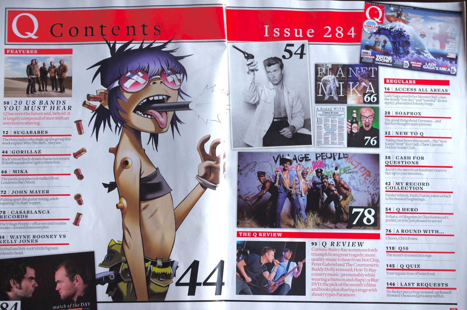 Q Magazine Contents Pages
I know this contents page isn't from
The Fader magazine, but i couldn't find a contents page for the
Fader, so i decided to use a contents page from Q magazine, as it's in the same
genre as my chosen magazine genre.
This is a double contents page, which
im interested in doing for my magazine.
However, i'm unsure if i can, as i'm only
allowed to submit up to 4 images, and i don't know if the
double page spread has to be split into two images. If i can, id have
more room for images and text, to stop it looking littered.
I like the big page numbers put onto the
images, if you know what that image is, you know straight away what page o go
to. because of this, i think they've stuck to the stark colour scheme, as you
wont spend much time on it if your going to quickly skip ahead to the page you
want.
If you want to read it thoroughly however,
there is alot of information about every article and story inside the
magazine, the imges being slanted wo make it appear jam packed,
or perhaps like a sketchbook.

There are alot of images on here, with nice
big page numbers like in Q Magazine. This draws the eye to
each individual image, though the dull colours detract somewhat. In
that sense, the theory of having stylish, dim
images doesn't work well in the respect of having
a vibrant and lively cover, but is successful in being
visually striking. the dark colours contrasting with the plain white backdrop
and the pale blue subscription prompt.
The page numbers on this contents magazine are
black in a white box. Compared to the above Q Magazine page numbers
of white in a black box, but one in a white box with black font, and one
without a box entirely, has inspired me to have large page numbers on my images
which are coloured to suit the image for maximum visibility.
 Uncut
Contents Page
Uncut
Contents Page
The one
large greyscale image makes the contents page seem classy and neat. The clear
colour scheme stands out well against the plain white background, and the
greyscale adds a touch of nostalgia to the image, which it being a farewell
article makes sense.
The large
page numbers are also evident, and successful in getting across a no-nonsense
vibe, as well as clearly stating what page has what featured on it.
The
greyscale image of a man playing guitar with a drum kit in the background,
suggest closeness to the performers, as if he’s playing for the reader
directly. This can work to make the reader feel they have a commitment to the
magazine, and so hook in the viewer emotively as well as visually.
Front Cover Draft

I'm
thinking of having an image of him on my magazine, because he's wacky and
alternative, and also he was featured in the 9/1/12 issue of NME Magazine,
and the 31/1/12 issue as well. And seeing as how NME Magazine is in the right
genre for my magazine, and so features relevant people, I’ve chosen him to
feature in my magazine. Also because I like him, and his new show ‘Luxury
Comedy’ on channel 4, it’s so quirky and out there, different to anything else
I see on TV.
 I
have a bar code with a price and issue number on, as well as a main
image and space for a logo on the top half of the page. I haven’t got a logo
yet, as I’m not sure what to call my magazine yet. When I know, I'll create a
few different logos, and choose my favourite from the lot, and then add it to
the draft.
I
have a bar code with a price and issue number on, as well as a main
image and space for a logo on the top half of the page. I haven’t got a logo
yet, as I’m not sure what to call my magazine yet. When I know, I'll create a
few different logos, and choose my favourite from the lot, and then add it to
the draft.
The keyring
space I decided to add, as it’s nice to have a free gift with a magazine, especially
seeing as how the magazine is £3.50, it can be an added incentive to buy, and
look out for different versions of the keyring.
The
border around the cover, gives it a definite house style that I can use and
utilise throughout the magazine in order to get the best flow.
The
writing is just a few ideas as to what stories and articles can be included in
the contents pages, still have no clue what to put on the double page spread :S
THE
BIGGEST EVER ISSUE! banner grabs the eye, it would be in a bold colour along
with the logo and top of barcode, not only to make it visually appealing, but
to aid in getting the magazine flying off the shelves.
Saturday, 18 February 2012

Subscribe to:
Posts (Atom)