 Kerrang! Contents page
It's rather busy, and quite cluttered, which
is probably because of the large image sizes taking up most of the A4
space available.
For that reason, i'm tempted to make a double
page contents page, in order to have nice big images and uncluttered text.
The colours are bold and
striking, continuing where the front cover left off. There isnt much
blank space, which overall makes the page seem busy and 'happening'.
The house style adheres to the colour scheme
set forth by the front cover, allowing the the style to flow from page to page.
The mixture of band photos, live photos and
album covers, shows the magazine covers a wide range of music mediums, which
means that all kinds of rockers will find something to interest them
in this issue.
Some images are slanted, and all have a shadow
effect on. This makes them feel like they're popping off the page at the
viewer, keeping up the edgy feel as put across by the cover and whole
magazine/brand overall.
 Mix Mag Contents Page
I'm not sure if this contents page is from the
same issue as the contents page i analysed, so I cant comment on the flow, but
it does share simular house styles, such as the fonts used, and the simple
colours.
I like this contents page, its got all the
information needed, but its uncluttered with nice big pictures.
Only problem i think, is that it looks abit
boring, with lots of plain white space which although is used effectively,
makes it slightly dull.
It's a mixed genre magazine, however, the
mainly masculine images and just one, small image of a woman, can suggest that
its aimed at either a female demographic, or simply a range of ages, as there
is an image of a young man, of a middle aged man, and what appears to be a
young woman.
The colours stand out well on the plain white
background, the block of yellow on the lower image attracting the eye almost
immediately, letting you know straight away that although its a
serious magazine, it has a playful vibe.
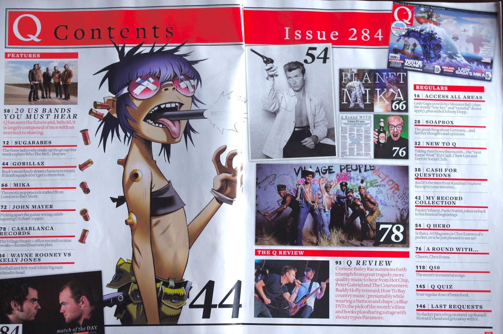 Q Magazine Contents Pages
I know this contents page isn't from
The Fader magazine, but i couldn't find a contents page for the
Fader, so i decided to use a contents page from Q magazine, as it's in the same
genre as my chosen magazine genre.
This is a double contents page, which
im interested in doing for my magazine.
However, i'm unsure if i can, as i'm only
allowed to submit up to 4 images, and i don't know if the
double page spread has to be split into two images. If i can, id have
more room for images and text, to stop it looking littered.
I like the big page numbers put onto the
images, if you know what that image is, you know straight away what page o go
to. because of this, i think they've stuck to the stark colour scheme, as you
wont spend much time on it if your going to quickly skip ahead to the page you
want.
If you want to read it thoroughly however,
there is alot of information about every article and story inside the
magazine, the imges being slanted wo make it appear jam packed,
or perhaps like a sketchbook.

There are alot of images on here, with nice
big page numbers like in Q Magazine. This draws the eye to
each individual image, though the dull colours detract somewhat. In
that sense, the theory of having stylish, dim
images doesn't work well in the respect of having
a vibrant and lively cover, but is successful in being
visually striking. the dark colours contrasting with the plain white backdrop
and the pale blue subscription prompt.
The page numbers on this contents magazine are
black in a white box. Compared to the above Q Magazine page numbers
of white in a black box, but one in a white box with black font, and one
without a box entirely, has inspired me to have large page numbers on my images
which are coloured to suit the image for maximum visibility.
 Uncut
Contents Page
Uncut
Contents Page
The one
large greyscale image makes the contents page seem classy and neat. The clear
colour scheme stands out well against the plain white background, and the
greyscale adds a touch of nostalgia to the image, which it being a farewell
article makes sense.
The large
page numbers are also evident, and successful in getting across a no-nonsense
vibe, as well as clearly stating what page has what featured on it.
The
greyscale image of a man playing guitar with a drum kit in the background,
suggest closeness to the performers, as if he’s playing for the reader
directly. This can work to make the reader feel they have a commitment to the
magazine, and so hook in the viewer emotively as well as visually.
No comments:
Post a Comment