Friday 30 March 2012

State Before Easter Holidays


Front cover:
  • Added a strapline to identify what genre of music it's aimed at.
  • Only have the main feature on the image, I have changed the upper left triangle to what the new contents are.
  • I edited the image to remove blemishes, make it look more professional.


Cover Page
  • Reduced amount of text
  • Got rid of some lines
  • Cut down to just two images (main feature and montage)


Double Page Spread

  • Adjusted colours, tried to make it look unique with inclusion of a different text, but continued house style  
  • Added another column of text

Thursday 29 March 2012

Rough Cut Feedback

                                                                       
Front Cover
 
Positive:
  • Quirky, Striking image
  • Strong colour scheme
To be improved:
  • Need to clarify genre, what is it?
  • More focus on music
  • Could improve fonts
  • Dig main feature


Contents Page

Positive:
  • Inclusion of front cover
  • Features montage
  • Chunky page numbers
  • Recycle details etc
To be improved:

  • Too table like
  • Use less text


Double Page Spread

Positive:

  • Details, some layout elements
To be improved:

  • Needs style variation
  • Photo quality
  • Needs 3 columns, more text needed


Wednesday 28 March 2012

Photoshop For Dummies

Looooooooading
Hello and welcome to Photoshop for dummies! Just sit back and relax, while I tell you stuff I know!

Loaded and ready for action
Boom! there it is!
Barely used half of these
The Move Tool is self explanatory, it allows you to move layers around. Simples.
The Marquee Tool acts like a shape tool really, allows you to select content of a layer much like the selection tool in MS Paint.
The Lasso Tool is the same as the Marquee Tool, only it allows you to draw selections freehandedly. This is useful for if you want to select something complex and not of a basic shape.
The Wand Tool lets you select within the confines of edges, the amount it selects can be defined by the tolerance meter which appears on the bar at the top once you've selected the tool.
The Crop Tool allows you to cut the canvas (whole image) down to the desired size.
The Eyedropper Tool lets you take a sample of a particular colour to replace the current colour in your swatch. This makes it easy to switch between colours, and speeds up the process of whatever your doing.
Healing Brushes and the Patch Tool are ones I used in my project, and they're used for covering up and fixing.
The Brush Tool is your paintbrush, when selected, options for brush head type and size appear on the bar at the top.
The Stamp Tool allows you to take a sample of a layer, then 'paint' it at another location on the canvas.
The History Brush Tool acts as a kind of eraser tool, only it rubs out the image and replaces it with what colour is underneath.
The Eraser Tool does what it says on the tin. It rubs out stuff.
The Gradient Tool allows you to create a gradient in the colour of your current swatch. The Paint Bucket Tool completely fills in a layer with your colour swatch.
The Blur/Smudge Tool makes what your using the tool on go all smudgy.
Dodge/Burn tool makes the colours go funny.
The Pen tool allows you to create a freehand straight line, which allows you to curve at the edges.
The Text Tool allows you to create text.
Selection Tool allows selection.
Shape Tool allows you to create shapes.
3D Tool means you can create 3D stuff.
3D Camera Tool means you can look around the 3D stuff.
The Hand Tool lets you move around the layer.
The Zoom Tool lets you zoom in or out of the image.
Or you could do the keyboard shortcut Ctrl+O
To open a document, you first click on file, then on open. To open a recent document, you can hover your mouse over the drop down menu 'Open Recent' then click on the document you want.
You can create a new document by selecting new, but in this tutorial, i'm going to be using a document that already exists.
Lots of files! All the photos I took
Here i'm just looking through my images, looking for one to work on. Each image document show in the little preview at the bottom, along with the file size. The bigger the file size, the more effort it'll take to load.
For this tutorial I used the image that appears on my front cover. On the magazine, I flipped it horizontally.
It's open! As this is a JPEG image, the image is the background layer. A locked layer (little padlock symbol) means you can't move it.
Not everyone does this, but I find it's handy to have a spare original layer hanging around.
 I'm going to convert the background layer into a proper layer. I right click the layer causing this menu to appear. I then....
Next up is to duplicate it.
Click the Layer From Background option and click ok in the window that pops up. It's now a layer!
 I right click the layer, and select 'Duplicate Layer'.
I then make the bottom layer non visible by clicking the little eye picture. This helps prevent confusion in the long run.
Viola! We have two layers of the same. Now for work.
Yeehaw!
 I've now selected the Magnetic Lasso Tool, and made the bottom layer invisible. I'm going to be working on the top one.
Just quickly using it in this tutorial, nothing too neat.
 Clicking near what I need to select, I move the tool along it, and the lasso follows. It makes these little boxes, which show segments inbetween little lines its made, as it doesn't work in curves.
AH CHOOO!
 Ah no! I sneezed and it went crazy! Nevermind, by using the backspace tool, we can go back to where we were.
Fixed!

Ready for deleting.
 I've now quickly finished outlining what i need, and with a double click, its automatically closed it and turned it into a selection. But this is selecting inside of the outline, we don't wanna delete the inside...
Right clicking the selection bring up this little menu. We click select inverse, press delete...
Rough around the edges, but it was a quicky.
And the outside of the selection is deleted. This checkered stuff means its transparent.
The quick selection tool can also be used for the cutting of the outside, i just find the magnetic lasso does a better job.
 To get rid of that triangle of background, I use the Quick Selection Tool.
 I click and drag inside the triangle, and it automatically selects it.
A quick press of delete and it's all good! I then deselected the selection by using Ctrl+D.
You can now go round the edges with the eraser Tool to neaten it, using a layer of colour behind (inbetween layer0 and layer0 copy) the top layer can help see the edges more clearly.

Tuesday 27 March 2012

Diary Entry Three

I've finished the initial sketches (still need to colour double though), done my audience research (need to record someone answering questions), and my rough cuts are done in time for the deadline that was on the 20th of march.
In upcoming weeks, im going to post my rough cuts with evaluation and feedback received, my photos and images im going to be using (originals and edited versions), and finish colouring the double page draft and record the audience research answers.
I'll update the diary when I've completed things.

Monday 19 March 2012

Audience research


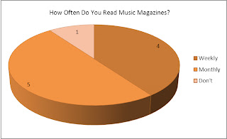
1, How often do you read music magazines?

I asked this question in order to get an idea of how often my music magazine would go out, I’ve decided weekly, and that will correspond with a lowish cost, making it more likely it will be bought every week.
Five out of ten people who filled in my questionnaire read music magazines monthly, compared to four people who read them weekly; it’s only a difference of one, so I believe I’m safe to have a weekly published magazine. If I asked more people to fill in the questionnaire, then I think there’d be a bigger gap between the two, with more who don’t read music magazines.
Continuing on the people who don’t read music magazines, the people I asked to fill in my questionnaires are people I know to read them, with one I knew didn’t. I chose this range so I could get a mixture or responses. Though I wanted more who didn’t read them to fill it in. The intended audience is young to older teens/young adults.

2, How much do you usually pay for an issue?

I chose this question to ask, as it would give me an idea of cost to regularity ratio. From this chart, it looks like the people who get the magazine monthly are either paying less than the weekly people, or the monthly people are paying more with one paying less.
I think the latter is more plausible, as paying £5 a month for a magazine is more attractive then paying £5 a week.
Again, the one person who doesn’t read music magazines doesn’t pay anything, obvious as they don’t read them, but that one could be explained as someone who doesn’t buy the magazines themselves, simply reads a siblings or waiting room or whatever copy of the magazine, rather then buy it themselves. This makes this question data not very reliable, and so would require tweaking if I did the audience research again.

3, How much would you personally prefer to pay?

Not surprisingly, a big 60% wanted to pay a low amount for a music magazine. Where that is obvious why (nice and cheap), the quality of such a low priced magazine would be in question. Such a price would be more characteristic of a weekly mini mag anyway, whereas the more expensive would be the chunky monthly issues.
No one wanted to pay over £3 for a music magazine, which is interesting as £3+ is the average price of most music magazines I’ve seen. These results boil down to two simple answers. A weekly, cheap, low standard music magazine. Or an average priced, monthly or weekly, high quality magazine.

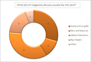
4, What bits of magazines do you usually like the best?


The majority of the vote went to Q&As/interviews, then posters/free gifts. Not many were interested in a new act feature (just 20%), with big images getting 30% and one person suggesting celeb facts
Q&A’s are what makes a magazine a magazine. Without them, there would just be a few features, images, and that would be about it. They are popular with the music audience as they wish to read about the star as they’re fond of them and wish to know more about their lives and personality, or even band dynamics and tips for beginners.
Everyone loves a free gift, and posters are expensive from shops, meaning it’s great to have them for practically free.
Old favourites are more popular then new upcoming acts. However, It’s important these starting out artists get exposure, or else no-one would have a clue who they are and where to find them., and nice big images of them can often introduce them more easily then any Q&A.

5, If the magazine came with a keyring, what would you like it to be of?

The majority went for a keyring of a musical instrument, which is an obvious choice for a music magazine. Two went for an animal, and two again went for a person.
It would be interesting to combine the two, having an animal/person holding an instrument. The keyring being for a charity for young children, animals would be a nice choice. I’ll expand this idea, and do a design page and put it on the blog.

6, Other than keyrings and posters, what else would you like to see included in a music magazine?

A big 80% went for relevant ads, being shown where to get a certain brand of fashion or being informed about the latest festivals are key to the reader’s experience of the magazine. Seven went for informal language, with six going for Q&As. Informal language can make the magazine feel more relaxed and laid back, inviting and open for the reader to dive right in.
Five went for posters and high quality images, three for competitions and two for new acts. This suggests they want to be actively engaged in the magazine, as competitions require interaction from the reader, and posters need to be taken out from the fiddly staples. High quality images are expected of a magazine, along with information about new acts.

Tuesday 6 March 2012

Diary Entry Two


The past week, I finished my analysis of the front cover, contents page and double page spread, and completed the hand drawn front page, contents page and double page spreads.
Next week, I'm going to be adding my coloured versions of my initial sketches, and start on the audience research. I need to type up my questionnaire I've written, and print some out for people to do. I also need to record someone responding on video, and put that on my blog.
But I can do all that at home, while in school, I’m going to work on my rough drafts using InDesign and Photoshop as I don’t have access to them at home.

Double page spread draft