 |
| Fusion Contents Page |
Throughout the prilimery project, I have tried to be organised
and efficient by keeping a daily write up of what I’ve been doing. I completed
the school magazine on the Tuesday, the same day that I started the main task
of the music magazine.
The style models I
chose for my contents page were Fusion magazine, and Evolve.
Fusion has an image on the top of the page, and all the
content written below in an easy to read font. Whereas Evolve has each category
of content in a different coloured box with a heading.
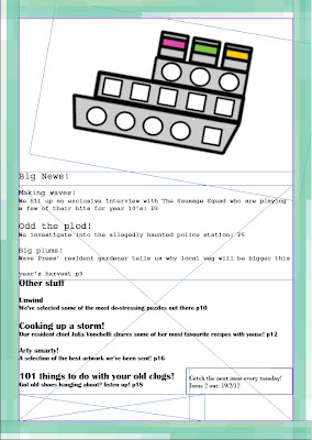
I have tried to combine these two in my contents page, by
having an image and text categorised into coloured boxes with bold titles. I don’t
however, have a note from the editor as seen in the Evolve magazine, or a
disclaimer as seen in Fusion, as I simply ran out of space.
Codes and conventions I’ve followed on both the front page
and contents, are casual language aimed at the audience of teenagers and young
adults, whom this magazine is aimed at. I’ve also adhered to the convention of
having images of the school on the front cover, as well as having a student
featured.
 |
| Evolve Contents Page |
By utilising these conventions however, it allows the reader
who knows the school, to immediately identify that this is a school magazine,
and the lack of a barcode or price conforms to the fact that school magazines
are very often free, and therefore have no need of barcodes or prices.
The colours I chose to adhere to the theme of the sea, as Whitley
Bay
If I could change anything, I would add a big ‘FREE!’ label
on the front, as well as a date and a strapline to help further promote it. I
would also fiddle around with the contents page, as the overlapping bars look
unprofessional, as well as the badly drawn bus and blank space on the top half
of the page.
To document my research, I used Microsoft Word, and added
colour with MS Paint, unprofessional I know, but I just wanted to quickly get
it presentable and posted. I have had experience with a similar program to
Photoshop which has helped a lot in learning to use it, and have access to the
program at home, which is handy, as I don’t have Photoshop at home, but have Paint,
Word, and Artweaver which is similar to Photoshop and free, enabling me to keep
to the style and post things at home.
I will use Photoshop to add decoration, and to do
brainstorms and things in the main task however, as I believe it looks more professional
and neat.
I also used InDesign, which was easyish to learn as it’s similar
to Microsoft Publisher, and uses a few of the same tools from Photoshop.
 For the logo, I used Photoshop. I used two different styles
of font (Lucinda Sans Typewriter and Minstral), and used a combination of the
Brush Tool, the Healing Brush tool, and the Spot Healing Brush Tool. Each Text
fragment was on a different layer, enabling me to move them about without affecting
the rest. Towards the end, I Linked together the text layers so they all move
at the same time, and moved them up and just under the ‘swirl’ to complete the
logo. The ‘swirl’ was made with two different shades of blue, and blended
together at certain points to create a wavy, watery effect like a wave.
The photograph I took with a school Nikon camera. It was on
Auto mode, meaning I didn’t have to adjust anything apart from the zoom and the
focus. I started taking pictures, but they came out blurry despite me focusing.
They came out clear when the media admin took them however, leading me to believe
that my hands were shaking slightly when taking the photo.
I set up a tripod, adjusted the focus, and took the picture
while trying not to touch the camera much. The photo still came out quite
blurry and grainy however, so I adjusted the brightness in Photoshop, and added
a Sharpen filter which slightly improved it.
The other photos (the school, the car park, the sandwich,
the artwork, the pathway) and images (the boat, the bus and the wave) were all
taken by me, and images were created by me. The boat and the wave it’s perched on
were made in Macromedia Fireworks, as I didn’t have access to Photoshop at the
time of making them, and they needed creating quickly in order for me to keep
to my plan. I have had experience in working with Fireworks, as I did ICT DiDA
in my GCSE’s, and I used Macromedia’s programs throughout.
The artwork is from my diagram of a ‘perfect island’ that I
created in my Philosophy lesson, its made from coloured paper, stuck together
with glue, and drawn on and written on with felt tip pens. The same room it was
created in, was actually where I took the photo of the car park from, as it
offers a great view of it.
The photo of the pathway is actually of a pathway next to a
main road in Percy Main. I was on my way back from work when I noticed it was a
great photo opportunity, and I took it on my camera phone.
 |
| My Front Page |
 |
| My Contents Page |


